Pre-University Work (Summer Project)

6 12 2008

As part of the terms of acceptance for my university, we had to create a storyboard based on the theme of ‘Consequences’, and although the final presentation never took place, I see no reason as to why I shouldn’t post them on my University blog.

My concept was based around the absence of ‘consequences’ and what would happen to society if consequences  were to be removed from reality. The breaking down of the human form as well as our environment was something that I took particular care to portray, creating a completely abstract and obscure take on a reality without consequences. The idea behind it being that nothing could exist without consequence, as everything is a consequence of something (Cause and effect). Hence the world implodes upon itself. This in itself is a contradiction, as the consequences of having no consequences is the implosion of life itself.

The basic story-line follows one isolated mans final moments of loneliness and bewilderment before the world finally destroys itself. If the idea was to ever make it to production, emphasis would be put on the characters body language to show emotions (as he has no facial features). This was an opportunity to expand on my previous animation ‘Some Assembly Required’ in which I also concentrated on portraying human emotions on a character with no facial features.

Here are some still from the storyboard (I shall not upload the entire series, as it is meant for presentation i.e. Not suitable for viewing without live explanation):

joe1test

Character sitting in barren landscape. This shot was removed from final, as it did not fit in with the rest of the story, but it is still a nice shot.

joe-test-4flat

The camera is consumed by darkness as it travels down a corridor, noise was added to the image to add to the negativity of the scene, smooth tones did not give the right message of loneliness and the dark.
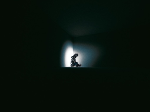
a2flat

Wide shot emphasizing characters isolation, as he desperately clings to the feeble remains of light (something I noted on human nature, concerning the human connection to light. Even those who are not afraid of the dark would still be drawn to light in a dark open space).

alone_by_jwakerley

Zoom in on character, his body language and gestures suggest loneliness and depression. He later begins to realize the full extent of how his body has changed when he inspects his hands etc. An opportunity to show a wide variety of emotions just using body gestures (such as fear, confusion, panic etc.).

All imagery was created in the 3D animation program, ‘Maya’, and then taken into ‘Photoshop’ for post-production (application of added noise, etc.).



Animatic (Final)

6 12 2008

The 5th and (most probably) final version of our animatic (Joseph Wakerley Edward Gould and Matthew Hargreaves).

Changes include:

– No more spoken words, titles instead (we just couldn’t get the speech correct, mainly due to our lack of voice acting experience)

– Added title

– Most prominently; swopping Matt’s part to the beginning, as it seemed a better starting point (as it matches the final frame etc.).

Any comments/suggestions are welcome.


David Anderson

5 12 2008

Animator David Anderson came to visit us yesterday,  giving us advice as well as showing us his previous work, very much like Claire Kitson and Candy Guard did. His work included ‘Door’ and ‘Deadsy’, his work is very abstract, I really liked his visual style, very different from the style I’m used to seeing from animators.

‘Door’:

‘Deadsy’

Both of them are good examples of abstract experimental animation……. Fantastic.


Claire Kitson/Candy Guard

2 12 2008

Candy Guard and Claire Kitson have visited us and given lectures as part of the guest lecture program, Candy Guard actually visited us quite some time ago, talking to us about her work in the past 20 years or so, including her book and her hit tv series ‘Pond Life’. She explained some of the woes and wonders of the animation industry and how she became an animator in the first place.

Claire Kitson visited us for very much the same reason, explaining how and why she began and what she had done in her career. Claire was one of the influential figures in Channel 4’s now defunct ‘4mations’. She told us of her previous work with Yuri Norschein who she described in her book:Yuri Norstein and Tale of Tales: An animator’s journey’. Her most recent book is: ‘British Animation: The Channel 4 Factor’ based obviously on Channel 4’s history with animation.

Unfortunately Claire finished with a rather bleak overview of the future of animation, saying how funding is now so limited, and that computer games are far more profitable for animators than actual film making. I don’t agree with this, and besides, if everyone did computer games, there wouldn’t be any money it that either.

Unfortunately I cannot find a video extract of the old Channel 4 ‘4mations’ animations that Claire was involved with, only the newer online animation ‘4mations’. I did however find this tribute page:

Claire Kitson Tribute link

and this page about her book on Yuri Norstein:

Claire Kitson link (Yuri Norstein Book etc.)

Candy Guard’s ‘Pond Life’ (Extract):


Walk Cycle with Philip Warner

2 12 2008

Guest Lecturer, Philip Warner, an animator (obviously) came back yesterday to teach us the process of creating walk cycles.

The process involves drawing the character on the same piece of paper, in a forward moving line, using guidelines etc. to keep proportions until you have create a step on both feet (then the animation loops back to the 1st step, that’s why it is called a cycle). I opted to go for a slightly different method; I noticed that many of my classmates overlapping drawings (particularly the feet overlapping as the foot contacts, then weight is applied, then begins to lift off) caused confusion as the mass of pencils marks made no sense. So I  drew my figures slightly spread out so that no feet overlapped, sometimes the trailing foot overlapped the leg, but this isn’t a problem.

All this means is that when it comes to drawing each frame now (tracing each part of the line of figures), I must move the paper over so that the feet are always in the correct place.

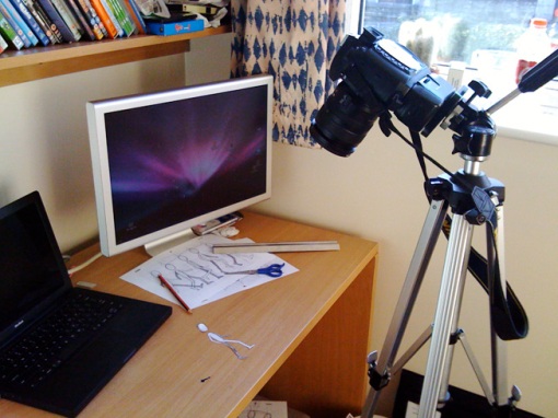
But I have also decided to shoot this differently, rather than under the normal cameras, I would scan, re-print and cut out the copies of my figures and use them as cutouts, shooting with my own SLR, in my room. This way I can also have a more interesting scene. Not just character walking on a white background, but a character walking across my desk etc.

alloverlap

Here you can see the guides, and the figure itself walking across the page. I didn’t want to draw too small so I overlapped onto two pieces of paper as a solution.

And below are some reference shots of the process involved in shooting this animated walk-cycle:

Ref 1

Ref 2

The final animation is slightly jittery, but I think it is still successful, especially for a first attemtp at a walk-cycle and cutouts simultaneously. If it wasn’t cutout and I’d simply drawn over each stage (see above image) then I don’t think it would be quite so jittered.

The lighting changes too unfortunately due to using natural light (I don’t have any studio lights in my room) but this is a minor distraction.


Recent Inspiration

2 12 2008

Artists that have inspired me recently, either as part of research to projects or just in general (including links):

Chris Landreth’s ‘Ryan’ (2005)

Part 2:

Chris Landreth’s ‘Ryan’ based on Ryan Larkin’s downfall, was of great help to me, especially after I saw an in-depth interview with him in which he described the principles behind his animation. The obscure depiction of reality was what intrigued me.

90 Degrees (Jules Janaud, Raphael Martinez-Bachel and Francais Roisin) (2006)

’90 Degrees’ by Jules Janaud, Raphael Martinez-Bachel and Francais Roisin, at the time they where completing a course in animation at a french university. The official website for the animation:

’90 Degrees’ Official Website

Also an old animation by Hans Richter during the twilight years of Dadaism. The illusion of depth is effectively created using simple squares and rectangles. This piece amongst as well as Viking Eggeling’s work (another Dada artist).

Hans Richter’s ‘Rythmus 21’ (1921)

Viking Eggeling’s ‘Symphonie Diagonale’ (1921)

The animation directly above is by Viking Eggeling, it demonstrates the use of line as a means of construction. Again, this was referred to in my soon-to-be-complete essay in time for the deadline on Thursday.

Other artists that are not animators, or are not well known for their animations that I have admired include:

Vincent Wakerley

Lesley Wakerley

Auguste Rodin, Stina Persson, Kandinsky, Mondrian, amongst others.


Re-adaptation Group Project

1 12 2008

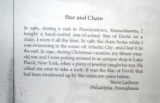
After the Adaptation project, we stayed in the same groups and where given the task of re-adapting the one of the other groups storyboards. We chose a group that did an adaptation of ‘Star and Chain’, using artists such as David Shrigley (main influence on our group’s character design) and David Hockney’s collage photographs as inspiration for the backgrounds. We changed the style completely, both the environments and the characters.

Although the scenes don’t link together perfectly, and the story isn’t completely obvious (visual communication at fault) it is a good attempt by our group. For one thing the characters and visual style, although unaccented by some, many and most agreed that it was style that worked well.

The story itself:

_dsc3951

Photograph of hand-out in class (book reference unknown)

Credits:

Photography: Joseph Wakerley

Character Design: Georgios Charalambous and Edward Gould

Character drawings for final: Georgios Charalmbous and Joseph Wakerley

Photography Manipulation: Joseph Wakerley

Layered designs over background: Edd Gould and Laura Aporado

Character integration: Joseph Wakerley

Writings cannot be uploaded due to copyright.

The images below depict the scenes in order (from top to bottom):

12

21

31

4

5

6

6a

7

8

9

10

111

122

13

14

15

16

17

18

19


Adaptation

30 11 2008

This is the storyboard for what was our first project at university, I was in a group with Edward Gould, Laura Aporado and Giorgos Charalambous. As a first attempt at a formal storyboard (for presentation) it is ok, I’m glad we went for an abstract idea with a reasonably defined style. Obviously the storyboards since then (see Re-Adaptation above) are far more accomplished than this. The visual communication is far better and the style and level of finish far greater than in the example below.

cities-and-desires-51

‘Cities and Desires’ written by Italo Calvino.

Referance: http://www.sccs.swarthmore.edu/users/00/pwillen1/lit/citysum.htm

The story describes a traveller coming across the city of Zobeide, which has a history concerning it’s construction.

He speaks of seeing a beautiful woman running naked through this city, this woman is not real, she is metaphorical, she represents the hopes and potential for the city to become as beautiful as she is. But as this dream has been pursued many times, without success, the vision of this woman begins to fade. More and more attempt to fulfill the prospects of this city, but none are successful.

We chose this story as although it describes a basic concept (city with potential etc.) it is described in a very surreal manner. We knew this was an opportunity to create something abstract and exciting.


adaptation-storyboard


Angles: Figure Drawing

30 11 2008

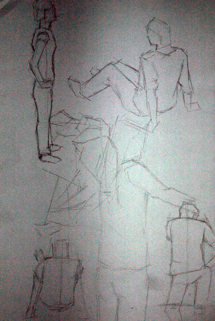
In Lewis’ drawing classes we have always been drawing figures, and we have always been trying new methods of drawing. Below is the newest selection of drawings, using harsh angled lines to define form. When looking at the models, we tried to pick out the angles of the body (spine, legs, etc.):

form10

form111

Using angles to describe a figure, before putting more detail in was more effective as a method of creating form than I first realized. I enjoyed using multiple straight lines to describe images, it helped greatly in developing my understanding of drawing figures.


Catch-Up: Drawing to Music

29 11 2008

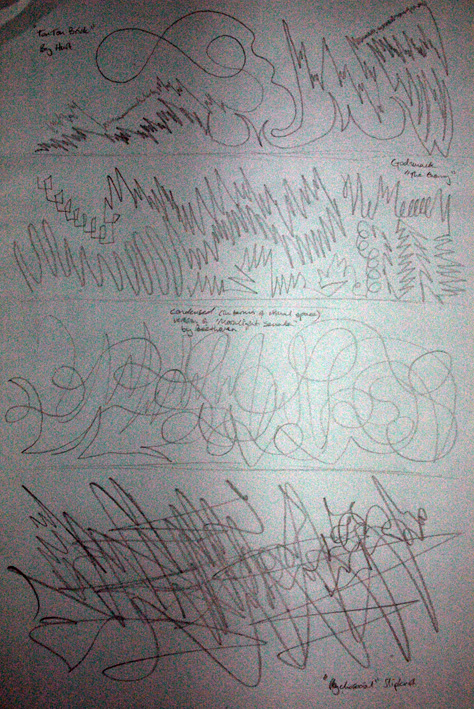
After I missed a lesson with Lewis I decided to catch up on some of the work, I asked a friend who attended the class (cheers Curly Matt) and apparently drawing to music was one of the prominent exercises in that lesson. Not knowing entirely what I was supposed to be aiming for, I drew back on my previous experiences, where I did something similar at college two years ago. The photographs of the drawings have bad levels of noise due to a high ISO, but the marks and dividing lines are still visible.

The marks are my visual response to the music, entirely through mark-making, nothing particularly figurative is present. I took this approach because although specific music brings out a specific emotion, the thoughts and feelings in terms of shapes and forms that are inspired by the music are entirely different (in most cases at least). Lines and marks are more expressive than literal figures.


musicdraw1

musicdraw2

From top to bottom, the music in order is:

Guano Apes “Open your Eyes”

Rolling Stones “19th Nervous Breakdown”

DragonForce “Through the Fire and the Flames”

Bottom Image:

Hurt “Ten Ton Brick”

Godsmack “The Enemy”

Beethoven “Moonlight Sonata” (Opening 2 minutes only)

Slipknot “Psychosocial”

Even if this isn’t what was taught in Lewis’ lesson, It’s still good mark making practice (aggressive marks for heavy metal Slipknot and more passive, smooth flowing marks for Beethoven etc.) as well as being generally enjoyable and almost therapeutic.